Motion Graphics Examples: 9 Formats Teams Can Actually Use
Min-woo Kim
Apr 6, 2026 · 11 min read
When people search for motion graphics examples, they usually get beautiful reels and almost no practical guidance. The problem with reels is that they show aesthetic possibility, not use-case clarity. Teams do not need inspiration in the abstract. They need to know which type of motion graphics works for a launch, a product update, an onboarding flow, or a social campaign. This guide is about usable examples, not just impressive ones.
A useful example shows context, not just style
A motion graphics example only becomes strategically useful when you know where it lives and what it is trying to achieve. The same animation treatment can feel sharp in a social ad and completely wrong in a product walkthrough.
That is why I group examples by communication job first and visual style second. Teams choose better motion formats when they begin with audience behavior instead of aesthetic preference.
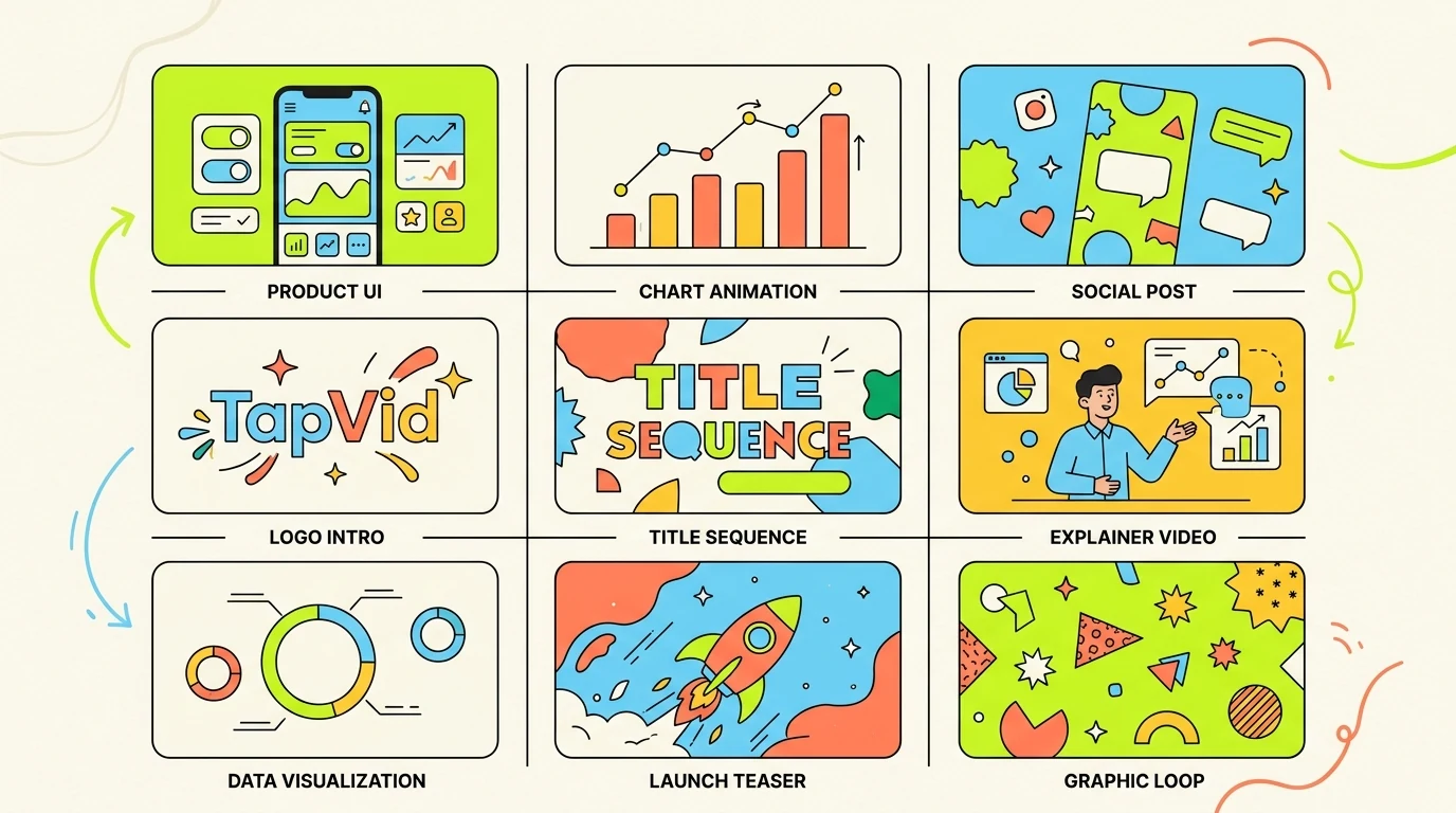
Nine motion graphics examples worth studying
- Product feature loop: short UI or concept animation for landing pages and release notes.
- Launch teaser: fast-cut motion graphics that build anticipation before a release or event.
- Explainer insert: simple diagram-led motion inside a longer educational or product video.
- Social stat card: animated numbers and short text built for silent autoplay on feeds.
- Brand manifesto opener: high-impact title sequence that sets tone before the main story.
- Onboarding sequence: guided motion that shows one product action at a time without overload.
- Sales walkthrough module: motion-led sequence that clarifies value before demo details.
- Research summary animation: chart and caption motion that turns findings into a narrative.
- Event screen loop: ambient branded motion designed to hold attention in physical spaces.
How to choose the right example for your team
The first filter is viewer attention. If people meet the video in a feed, your example should prioritize speed and immediate visual hierarchy. If they meet it on a landing page, you can afford slightly slower pacing and more explanatory structure.
The second filter is production repeatability. A visually stunning one-off example is useless if your team cannot reproduce it next month. Strong motion systems scale because they are based on repeatable scene logic, not constant reinvention.
What high-performing examples have in common
The best motion graphics examples share three traits: one clear message per scene, disciplined typography, and movement that reinforces meaning rather than distracting from it. The viewer should never have to ask where to look.
They also respect platform constraints. Social-first examples are readable at small sizes. Product and educational examples pace information sequentially. Event and brand loops emphasize mood over detail because the environment is different.
Using AI to turn examples into production-ready output
Examples are most valuable when they become templates for future work. AI-native workflows help here because they shorten the distance between reference and first draft. A team can define a style direction, generate variants quickly, and test which example format actually supports the message.
TapVid is strongest when your team already knows the format it wants. A source document, a short script, or a product brief gives the system enough structure to produce motion that is useful instead of generic.